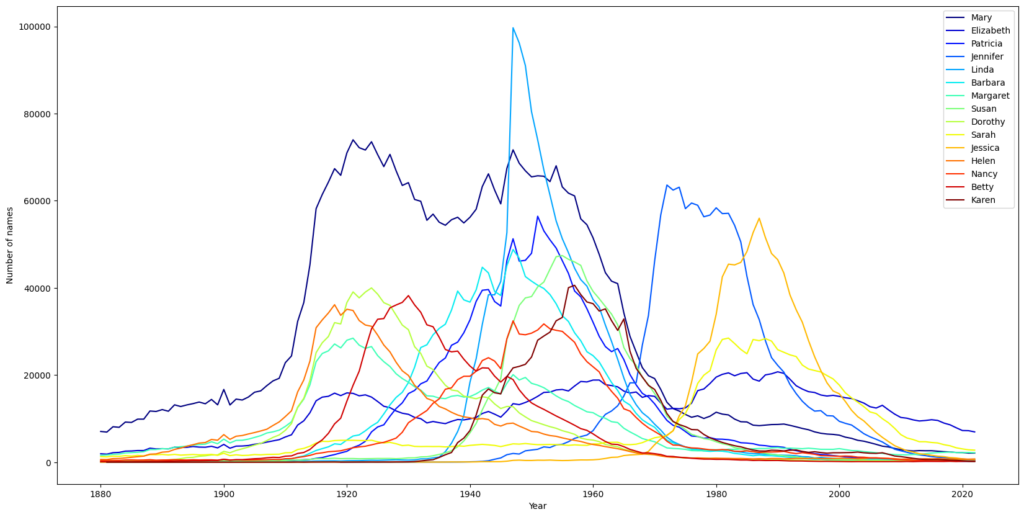
I’ve been spending lots of time looking at names recently. The US Government posts a dataset of the yearly popularity of baby names from 1880. I wanted a nicer way to let the names tell me about the relationships between them. I therefore made a 3d name graph to let name historical data speak for itself and show how name popularity evolved over time.

To keep it sane, I filtered by the allowed Danish names. I also cut off by popularity at some point, leaving in the ballpark of 1000 names per gender.

I then created a graph where the nodes are names and the distances between them is the similarity between the two names’ histories. For this I used mean squared error since I wanted to capture the generation difference, which might get lost with something like dynamic time warp.
To visualize, I made and deployed a simple react web app using a force directed graph visualization library. It takes in the name graph and and allows the nodes to arrange themselves neatly based on the link distances. I limit the number of links for performance reasons.
The app runs on https://baby.gravila.dev/. I recommend a large and wide screen with WebGL acceleration, since I didn’t optimize it for mobile use. I provide datasets for boy and girl names in a few variants selected for better and worse performance.
Interpretation
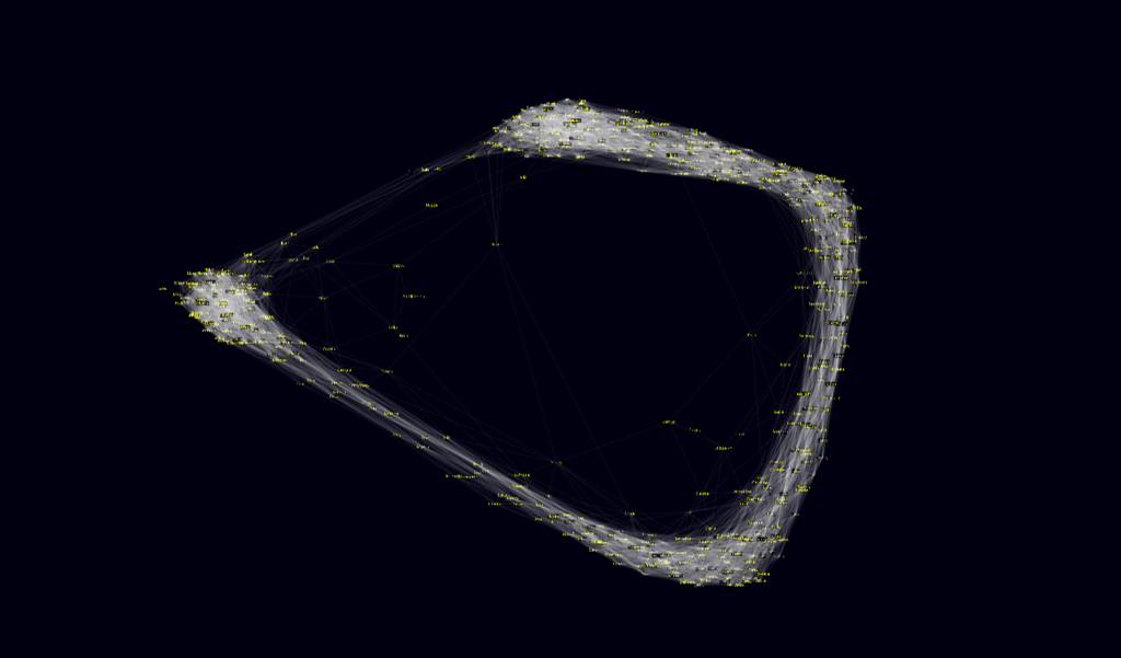
Though completely speculative and knowing well there are many exceptions, I find it very interesting to see how the top 545 girl dataset arranges itself into a semicircle. The fact that it looks like it’s working on completing itself validates the presence of some kind of cyclicality, usually named the 100 year rule. Names towards the center also tend to be names that have been popular longer and therefore tied to more periods. Otherwise it’s clear to see the end containing the names popular 100 years ago, the names which are very trendy now, and everything in-between.

